There’s something special about entering a room that just seems perfect. You know that feeling when the colors speak to you before the furniture even catches your eye?
I’ll never forget the first time I painted an accent wall teal in my living room—it completely improved my mood every time I stepped in.
Color has this tremendous capacity to alter energy, create delight, and make a house feel like home.
Whether you want tranquil blues, invigorating yellows, or passionate purples, adding colorful interior decor doesn’t have to be overwhelming or expensive.
Sometimes all it takes is one vibrant pillow, a fresh coat of paint, or a thoughtfully picked piece of art. Ready to explore some fun, doable methods to brighten your space?
Monochromatic Color Schemes
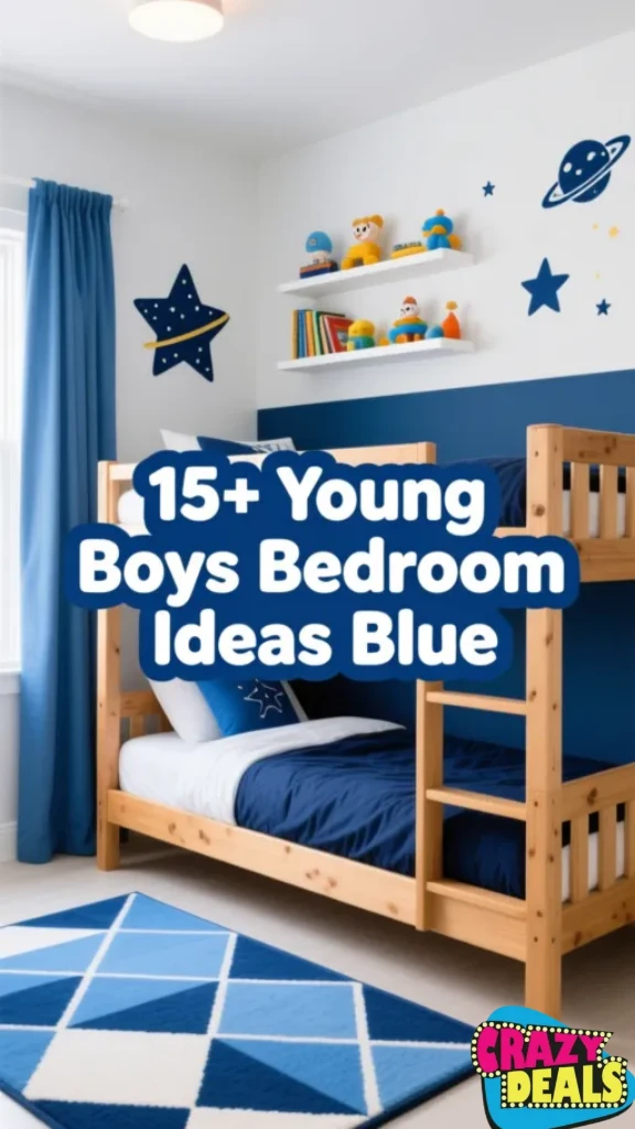
1. Dive Deep into All Things Blue

Going full-on blue might sound intense, but trust me, it works brilliantly when done well. Think navy walls coupled with sky blue bedding and cobalt accessories spread throughout.
The idea is mixing different shades and textures so the room doesn’t feel flat or dull. Add velvet cushions, linen curtains, and maybe a shiny ceramic vase. Monochromatic doesn’t mean monotonous—it means harmony.
Layer brighter blues near windows to keep things breezy, and use deeper tones in snug places. This method generates a classy, relaxing vibe that’s excellent for bedrooms or reading nooks. Plus, purchasing becomes easy when you’re seeking for only one color family!
2. Purple Power for Bold Personalities

If you enjoy drama and elegance blended into one, purple is your color. From gentle lavender to deep plum, this shade gives unlimited opportunities for creative expression. Use lilac on walls for a dreamy effect, then add in eggplant-colored blankets and mauve artwork.
Metallic gold or silver accessories work great with purple, bringing just the right amount of glitter without going overboard. I once helped a friend design her daughter’s room exclusively in purples, and the effect was really lovely.
Don’t shy away from blending warm and cool purples together—they play beautifully. This color combination seems both royal and fun, making it excellent for living rooms or creative studio spaces.
3. Green Everywhere for Natural Vibes

Green is nature’s favorite color, so why not invite it indoors? A monochromatic green room invites the outdoors in and provides a very pleasant mood. Mix sage green walls with emerald couches, olive curtains, and maybe some forest green accent furniture.
The beauty of green is how flexible it is—it may feel modern, vintage, tropical, or minimalist depending on your selections. Add actual plants to boost the effect and purify your air at the same time.
Texture matters here too; consider velvet, cotton, and natural wood finishes. Honestly, green rooms just make you breathe easier. Perfect for bedrooms, home offices, or anywhere you need to feel anchored and peaceful.
Complementary Color Schemes
4. Orange Meets Blue for Maximum Impact

Orange and blue sit opposite each other on the color wheel, which means they create amazing visual intensity together. Picture burnt orange throw cushions on a navy sofa or tangerine artwork against powder blue walls.
This mix feels both retro and current, somehow ageless in its appeal. The key is balancing the intensity—if you go bold with one hue, lighten the other. Try terracotta pots with blue-gray walls, or coral accents in a space with denim-blue furnishings.
I love how this mix seems both warm and bright at the same time. It’s particularly excellent in living rooms and dining places where you want conversation and connection to flow freely.
5. Classic Red and Green Done Right

Yes, red and green can work outside of Christmas—seriously! The issue is choosing the proper hues and not going overboard with either. Think deep burgundy coupled with soft sage, or cherry red highlights against olive green walls.
This combination feels rich, elegant, and surprisingly versatile when you nail the proportions. Use red sparingly as an accent through artwork, cushions, or a statement chair. Let green dominate through wall paint or larger furniture pieces.
Natural materials like wood and brass help connect everything together beautifully. This pattern works brilliantly in dining rooms or studies where you want a sense of warmth and heritage with personality.
6. Sophisticated Yellow and Purple Pairing

Yellow and purple combined form a surprisingly elegant and cheery combo that few people try but really should. Imagine mustard yellow cushions against a delicate lavender couch or golden accents in a space with deep purple walls.
This combo seems artistic and confident without being childish. The warmth of yellow balances the coldness of purple perfectly, generating visual appeal that never feels startling. Try creamy yellows with dusty purples for a vintage vibe, or go big with lemon and violet for something more contemporary.
Gray or white as a third neutral helps calm things down if needed. This color scheme shines in creative spaces, bedrooms, or anywhere you want to feel motivated and energized daily.
Analogous Color Schemes
7. Fiery Reds, Oranges, and Yellows Together

Want to feel energetic the instant you enter a room? Combine reds, oranges, and yellows for a warm, sunset-inspired palette that emanates enthusiasm. These surrounding colors on the color wheel merge effortlessly, providing a coherent effect that feels deliberate rather than chaotic.
Start with a delicate peachy basis, add tangerine accents, and pop in some deep crimson through artwork or fabrics. This concept works nicely in locations where you meet and socialize—think kitchens, living rooms, or creative studios.
The gradient effect formed by comparable hues is naturally appealing to the eye. Just remember to add enough neutrals like cream or beige to provide your eyes with resting spots throughout the space.
8. Ocean-Inspired Blues and Greens

If you desire tranquility and serenity, go no farther than the blue-green family. These colors remind us of tropical lakes, tranquil woodlands, and leisurely summer days by the lake. Combine turquoise with teal, seafoam with navy, or mint with emerald for a calming, harmonious palette.
This concept almost calls for natural textures—rattan, jute, driftwood, and linen all complement it nicely. I painted my bathroom in graduated colors of blue-green once, and it instantly became my favorite escape location.
Layer varying intensities to provide depth without presenting abrupt contrast. This palette works beautifully in bedrooms, bathrooms, and any location where relaxation is the priority. Plus, it photos well for those Pinterest-worthy shots!
9. Peachy with Pink and Coral Tones

Soft, romantic, and completely charming—pink, peach, and coral form a feminine yet elegant color scheme. These warm hues work wonderfully together because they share red undertones, making transitions feel natural and simple.
Try blush pink walls with coral pillows and peach-colored artwork for a beautiful, harmonious effect. This hue feels fresh and modern when matched with white furniture and gold accessories.
It’s not just for kids’ rooms either; adults appreciate this combination in bedrooms, dressing rooms, and comfortable reading spaces. The warmth pulls you in while the softness keeps things feeling delicate and peaceful. Add some foliage to ground the sweetness and prevent it from tasting too syrupy.
Using Neutrals as a Base
10. Start with Beige or Greige Foundation

Beige and greige (the beautiful gray-beige combination) might look monotonous, but they’re actually secret weapons for colorful room decor. These neutrals give a stylish backdrop that makes any accent color pop without vying for attention.
Paint walls in warm beige, then layer in vibrant linens, artwork, and accessories without worrying about clashing. The advantage here is flexibility—you can vary your color narrative yearly without repainting. Greige works particularly well in modern areas, while basic beige feels classic and ageless.
These neutrals also make small rooms feel larger and more open. Honestly, starting with a neutral base takes the strain off and enables you to experiment with brighter colors in smaller, changing quantities.
11. Classic White with Colorful Accents

White walls have been popular forever for good reason—they’re a blank canvas begging for your vivid personality to show through. Crisp white allows maximum versatility to play with any color combination your heart desires.
Go bohemian with jewel-toned pillows, minimalist with one strong statement item, or eclectic with a rainbow of accessories throughout. White reflects light well, making rooms feel spacious and airy. The difficulty is keeping things from feeling too antiseptic, which colorful decor addresses perfectly.
I appreciate how white lets you modify your room’s tone by just swapping out accessories. It’s particularly useful in small apartments or spaces with limited natural light when you need all the brightness you can get.
12. Warm Gray as Your Backdrop

Warm gray has become immensely popular because it offers refinement without the starkness of cool grays. This neutral has mild brown or beige undertones that give a warm background for vibrant accessories.
Pair warm gray walls with mustard yellows, terracotta oranges, or dusty pinks for a contemporary style that feels inviting. Unlike chilly grays that might feel institutional, warm gray adds depth while being neutral enough to blend with many color schemes.
It’s very flattering in rooms with lots of natural light. Layer diverse textures in similar gray tones, then add personality through bright artwork, plants, and textiles. This approach feels grown-up and intentional while yet giving lots of flexibility for creative expression and exploration.
Accenting with Bold Colors
13. Bold Throw Pillows Transform Everything

Never underestimate the power of colorful throw pillows—they’re literally the quickest way to add personality to any room. Swap out neutral cushions for colorful jewel tones, dramatic patterns, or unexpected color combinations.
Mix sizes, shapes, and textures for optimum visual interest. The beauty of pillows is how quickly you can alter them with the seasons or emotions. Feeling energized? Add bright yellow and orange. Need calm? Switch to blues and greens.
I probably have three different sets of pillow coverings that I change throughout the year. This strategy enables you to experiment with strong colors without commitment or substantial investment. Plus, colorful cushions photograph brilliantly and make your environment instantly more Instagram-worthy.
14. Eye-Catching Rugs Anchor Your Space

A bright rug can radically transform a room’s atmosphere while defining the space and anchoring your furniture arrangement. Choose a bold geometric pattern, a vivid Persian design, or a modern abstract piece that speaks to you.
Rugs are particularly useful for renters who can’t paint walls yet still crave color. The proper rug ties together disparate furnishings and provides your eye with a focal point. Consider scale carefully—too small looks odd, while suitably sized carpets make rooms appear larger and more planned.
I spotted a wonderful, colorful old rug at a thrift store once, and it truly provided the idea for my complete living room color palette. Bonus: rugs give warmth and sound absorption too!
15. Art That Speaks Volumes

Artwork is hands-down my favorite method to add numerous colors without dominating a place. A single huge statement piece or a gallery wall of smaller works can set the entire atmosphere and color theme.
Choose art with colors you want to pull throughout the room, then mimic those tones with accessories and textiles. Abstract works work great for this because they often have several hues you can reference.
Don’t just think paintings—consider colorful tapestries, framed textiles, or even three-dimensional wall sculptures. Art feels personal and intentional in ways that just ornamental goods sometimes don’t. Plus, supporting artists makes your decor important beyond just aesthetics, which I truly enjoy.
Color Psychology in Room Decor
16. Energize Your Day with Yellow

Yellow is sunlight in color form—it energizes, uplifts, and inspires creativity and discourse. Use it in locations where you want to feel energized and cheerful, including home offices, kitchens, or gym areas. Bright yellows serve as accents, while softer buttery yellows can cover bigger surfaces without dominating.
Be cautious with yellow in bedrooms though, as it might be too stimulating for restful sleep. Pair yellow with grays, whites, or natural wood tones to make it classy rather than infantile.
Even little dosages make a significant impact—a yellow chair, some sunshine throw pillows, or cheerful artwork can transform your entire atmosphere. The color psychology here is real; yellow actually makes most people feel better and more cheerful.
17. Relax and Restore with Blue and Green

Blues and greens are nature’s calming colors, proven to lower heart rate and lessen stress. These hues are great for bedrooms, bathrooms, and any location meant for leisure and relaxation. Soft sage green promotes balance and harmony, while soothing blues stimulate calm sleep.
Deeper teals and navy blues feel more refined while still keeping relaxing characteristics. I often recommend these colors for anyone battling with anxiety or sleep troubles.
The psychological effect is subtle but powerful—you’ll certainly find yourself breathing deeper and feeling more anchored in blue-green surroundings. Pair these hues with natural materials and gentle lighting to optimize the therapeutic impact. Your future relaxed self will thank you!
Experiment, Explore, and Energize Your Space
Color is highly personal, and what energizes one person could overwhelm another. The nice thing about decorating your own place is that you get to create all the rules. Start small if you’re nervous—maybe one accent wall, a few bright pillows, or a striking piece of artwork.
Pay attention to how different colors make you feel throughout the day and under different settings. Trust your intuition more than trends or laws. The “right” color scheme is whatever makes you smile when you walk through the door.
Don’t be scared to try something unexpected or blend hues that designers say shouldn’t work together. Your home should represent your personality, not a magazine spread. So take that paint sample, order those vivid couches, and start designing a room that actually feels like you!
- ERGONOMIC CONTOUR DESIGN: Memory foam cervical pillow with curved orthopedic shape provides optimal neck and shoulder su…
- PREMIUM MEMORY FOAM MATERIAL: Constructed with high-quality memory foam that contours to your head and neck, providing p…
- ADJUSTABLE SUPPORT: Features adjustable design allowing you to customise the pillow’s height and firmness to suit your i…
- ✔️ 𝐀𝐝𝐣𝐮𝐬𝐭𝐚𝐛𝐥𝐞 𝐬𝐡𝐫𝐞𝐝𝐝𝐞𝐝 𝐦𝐞𝐦𝐨𝐫𝐲 𝐟𝐨𝐚𝐦 𝐥𝐞𝐭𝐬 𝐲𝐨𝐮 𝐜𝐮𝐬𝐭𝐨𝐦𝐢𝐳𝐞 𝐥𝐨𝐟𝐭 𝐚𝐧𝐝 𝐟𝐢𝐫𝐦𝐧𝐞𝐬𝐬 𝐟𝐨𝐫 𝐨𝐩𝐭𝐢𝐦𝐮𝐦 𝐬𝐥𝐞𝐞𝐩
- ✔️ 𝐈𝐝𝐞𝐚𝐥 𝐟𝐨𝐫 𝐛𝐚𝐜𝐤 𝐚𝐧𝐝 𝐬𝐢𝐝𝐞 𝐬𝐥𝐞𝐞𝐩𝐞𝐫𝐬 𝐬𝐞𝐞𝐤𝐢𝐧𝐠 𝐫𝐞𝐥𝐢𝐞𝐟 𝐟𝐫𝐨𝐦 𝐧𝐞𝐜𝐤 𝐩𝐚𝐢𝐧, 𝐬𝐩𝐨𝐧𝐝𝐲𝐥𝐢𝐭𝐢𝐬 𝐚𝐧𝐝 𝐬𝐡𝐨𝐮𝐥𝐝𝐞𝐫 𝐬𝐭𝐢𝐟𝐟𝐧𝐞𝐬𝐬
- ✔️ 𝐇𝐞𝐥𝐩𝐬 𝐚𝐥𝐢𝐠𝐧 𝐧𝐞𝐜𝐤, 𝐬𝐡𝐨𝐮𝐥𝐝𝐞𝐫𝐬 𝐚𝐧𝐝 𝐬𝐩𝐢𝐧𝐞 𝐭𝐨 ?𝐞𝐝𝐮𝐜𝐞 𝐩𝐚𝐢𝐧 𝐚𝐧𝐝 𝐬𝐭𝐢𝐟𝐟𝐧𝐞𝐬𝐬
- ✔️ 𝐀𝐝𝐣𝐮𝐬𝐭𝐚𝐛𝐥𝐞 𝐬𝐡𝐫𝐞𝐝𝐝𝐞𝐝 𝐦𝐞𝐦𝐨𝐫𝐲 𝐟𝐨𝐚𝐦 𝐥𝐞𝐭𝐬 𝐲𝐨𝐮 𝐜𝐮𝐬𝐭𝐨𝐦𝐢𝐳𝐞 𝐥𝐨𝐟𝐭 𝐚𝐧𝐝 𝐟𝐢𝐫𝐦𝐧𝐞𝐬𝐬 𝐟𝐨𝐫 𝐨𝐩𝐭𝐢𝐦𝐮𝐦 𝐬𝐥𝐞𝐞𝐩
- ✔️ 𝐈𝐝𝐞𝐚𝐥 𝐟𝐨𝐫 𝐛𝐚𝐜𝐤 𝐚𝐧𝐝 𝐬𝐢𝐝𝐞 𝐬𝐥𝐞𝐞𝐩𝐞𝐫𝐬 𝐬𝐞𝐞𝐤𝐢𝐧𝐠 𝐫𝐞𝐥𝐢𝐞𝐟 𝐟𝐫𝐨𝐦 𝐧𝐞𝐜𝐤 𝐩𝐚𝐢𝐧, 𝐬𝐩𝐨𝐧𝐝𝐲𝐥𝐢𝐭𝐢𝐬 𝐚𝐧𝐝 𝐬𝐡𝐨𝐮𝐥𝐝𝐞𝐫 𝐬𝐭𝐢𝐟𝐟𝐧𝐞𝐬𝐬
- ✔️ 𝐇𝐞𝐥𝐩𝐬 𝐚𝐥𝐢𝐠𝐧 𝐧𝐞𝐜𝐤, 𝐬𝐡𝐨𝐮𝐥𝐝𝐞𝐫𝐬 𝐚𝐧𝐝 𝐬𝐩𝐢𝐧𝐞 𝐭𝐨 ?𝐞𝐝𝐮𝐜𝐞 𝐩𝐚𝐢𝐧 𝐚𝐧𝐝 𝐬𝐭𝐢𝐟𝐟𝐧𝐞𝐬𝐬
- ERGONOMIC NECK & HEAD SUPPORT FOR MAXIMUM COMFORT: The Boldfit Travel Neck Pillow is designed to provide superior neck a…
- PREMIUM MEMORY FOAM & INFLATABLE DESIGN FOR CUSTOMISED FIT: Crafted with high-density memory foam and an inflatable core…
- BREATHABLE, WASHABLE COVER FOR HYGIENE & FRESHNESS: Designed for long-term use, the Boldfit Flight Pillow features a bre…

- STOP NECK PAIN FROM RUINING YOUR LIFE – Upgraded contour to perfection by chiropractors, our cervical neck pillow more e…
- LESS IS MORE, BE COMFORTABLE -“Compared to pillows with hollow design, I got a shorter adaptation time and higher comfor…
- ADJUSTABLE LOFT, ALL IN CONTROL! The wrong pillow height causes neck pain to build up night by night. Our adjustable pil…
- 🥰 ELEVATE YOUR BEAUTY SLEEP : This 100% polyester satin silk pillow cover protect delicate hair from scratches, creases …
- 🥰LEAVE SKIN HYDRATED : Experience the next generation of revolutionary fabric, highly advanced satin pillow cover fabric…
- 🥰EXCLUSIVE USER FEELING : Go Well Satin Pillow Cover Envelope closure end design prevents your pillows from escaping dur…
- Bed Pillow for Side Sleepers : Get the most amazing night’s sleep with Lane Linen’s standard pillows set of 2 (each pill…
- Cooling pillows for Sleeping : Say goodbye to sweaty, uncomfortable nights and stay cool and comfortable all night long….
- Down Alternative Filling : Our standard pillow is filled with down alternative fibers providing delightfully soft and cu…
- ✅ Package Contents – 4 Microfiber Pillows 16 x 24 Inches White Colour Vacuum Packed For Easy Expansion And Everyday Use
- ✅ Superior Softness – Crafted With 100 Percent Virgin Microfibers These Hotel Quality Pillows Offer Cloud Like Softness …
- ✅ Customizable Comfort – Adjustable Fiber Filling Lets You Increase Or Decrease Pillow Height To Achieve Personalized Su…

- ✅ Package Contents – Pillow Set Of 2 In A Vacuum Packed Bag That Must Be Cut To Expand Perfect For Bedroom Living Room A…
- ✅ Item Dimensions – 16 x 24 Inches (40.64 Cm x 60.96 Cm) Standard Size White Colour Bed Pillows Suitable For Side Sleepe…
- ✅ Customizable Fiber Filling – Adjustable Pillow With Removable Fiber Filling Lets You Increase Or Decrease Height For P…
- FULL SIZE PILLOW: At 27 x 18 inches, unlike other pillows, our full size pillow is designed to provide comfort without f…
- HOTEL-LIKE CLOUD COMFORT: Inspired by luxurious hotel pillows, this ultra-light microfiber pillow gives a soft & plush f…
- 2 YEARS NO LUMPS GUARANTEED: This Cloud pillow is crafted with premium 100% virgin microfiber that stays evenly fluffy w…
- Pillow Dimension: 25 (L) x 16 (W) inches, Standard Size
- MATERIAL: Open-cell memory foam . COVER: SoftTouch Bamboo Fibre Fabric
- COMFORT: Medium-firm supportive feel CONSTITUENTS: Open-cell memory foam, Soft Touch Bamboo Fibre Fabric Cover.
- FULL SIZE PILLOW: At 27 x 17 inches, unlike other pillows, this full size pillow is designed to provide comfort without …
- COMFORT FIT FOR ALL SLEEPERS: Provides a medium-soft, luxurious feel while offering steady support for your head & neck,…
- 15D POLY FIBER FILL FOR CONSISTENT SUPPORT: Filled with premium 15D poly-fiber, this pillow provides a balanced medium-s…
- ✅ Package Contents – 4 Grey Microfiber Pillows 16 x 24 Inches Vacuum Packed For Easy Expansion And Everyday Use
- ✅ Superior Softness – Crafted With 100 Percent Virgin Microfibers These Hotel Quality Bed Pillows Provide Cloud Like Sof…
- ✅ Customizable Comfort – Adjustable Fiber Filling Lets You Modify Pillow Height For Personalized Support Neck Alignment …
- Soft and Fluffy: Crafted with poly fill, providing a comfortable sleeping surface that cradles the head and neck.
- Easy Maintenance: Machine washable and tumble dryable, offering convenience for regular upkeep.
- Durable Construction: Resilient polyester fiberfill maintains shape and loft over time, ensuring lasting support.
No products found.
FAQs
What colors make a room look bigger?
Light hues like white, soft gray, pale blue, and cream reflect light and provide an airy sense that optically extends tiny areas. Add mirrors to intensify this effect even more.
Can I mix warm and cold colors in one room?
Absolutely! Mixing warm and cool tones gives depth and interest. Just use one temperature as your major palette and the other as an accent for balance and harmony.
How many colors should I use in one room?
A good rule of thumb is the 60-30-10 guideline: 60% dominant color, 30% secondary color, and 10% accent color. But honestly, trust your sight and what seems good to you.
What’s the best way to add color without painting?
Textiles are your best friend—throw pillows, blankets, curtains, and carpets instantly bring color. Artwork and decorative items are nice too, and they’re easy to swap out later.
Do I need to match wood tones to my color scheme?
Not necessarily! Mixed wood tones actually offer character and warmth. Just make sure your color pallet complements the undertones (warm or cold) in your wood furniture.